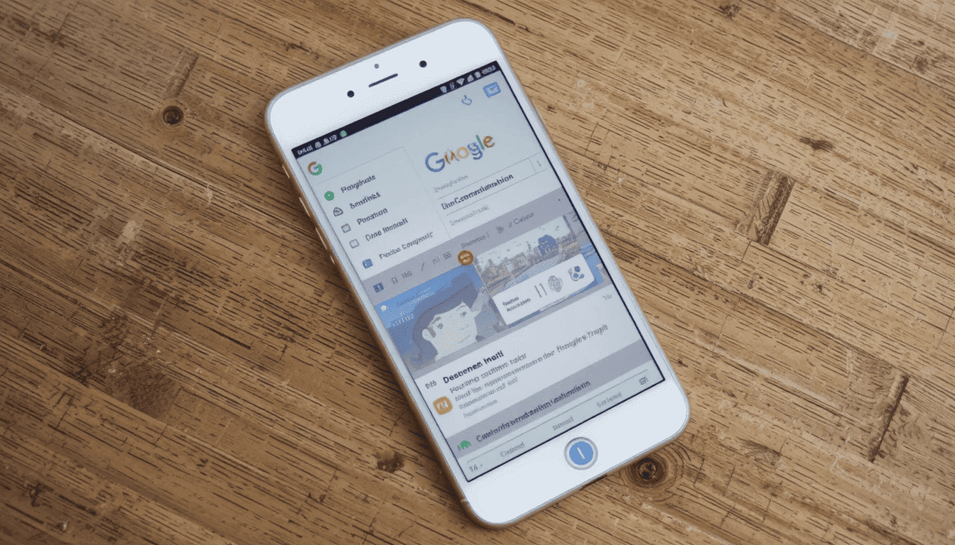


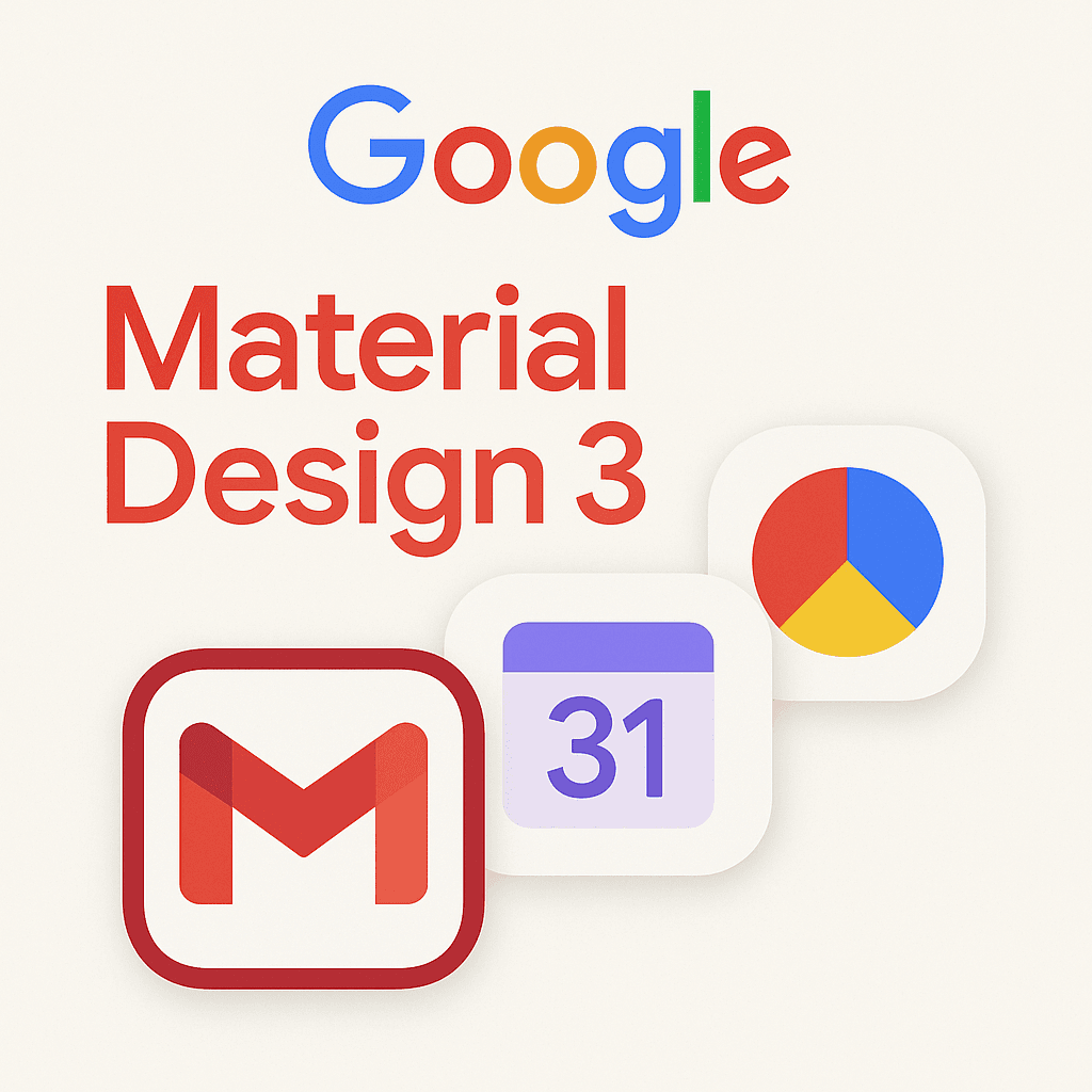


The Gmail app on iPhone and iPad has finally received Google’s Material 3 Redesign. This update introduces a completely refreshed look, aligning the interface with Google’s latest design language and delivering a more modern, consistent user experience across platforms.
a more consistent platform experience.
After Android users had had it for some time, iOS users finally tasted Google’s updated design philosophy, Material You.
Key Features of the Redesign
Several changes to the Gmail interface are in line with the Material 3 update:
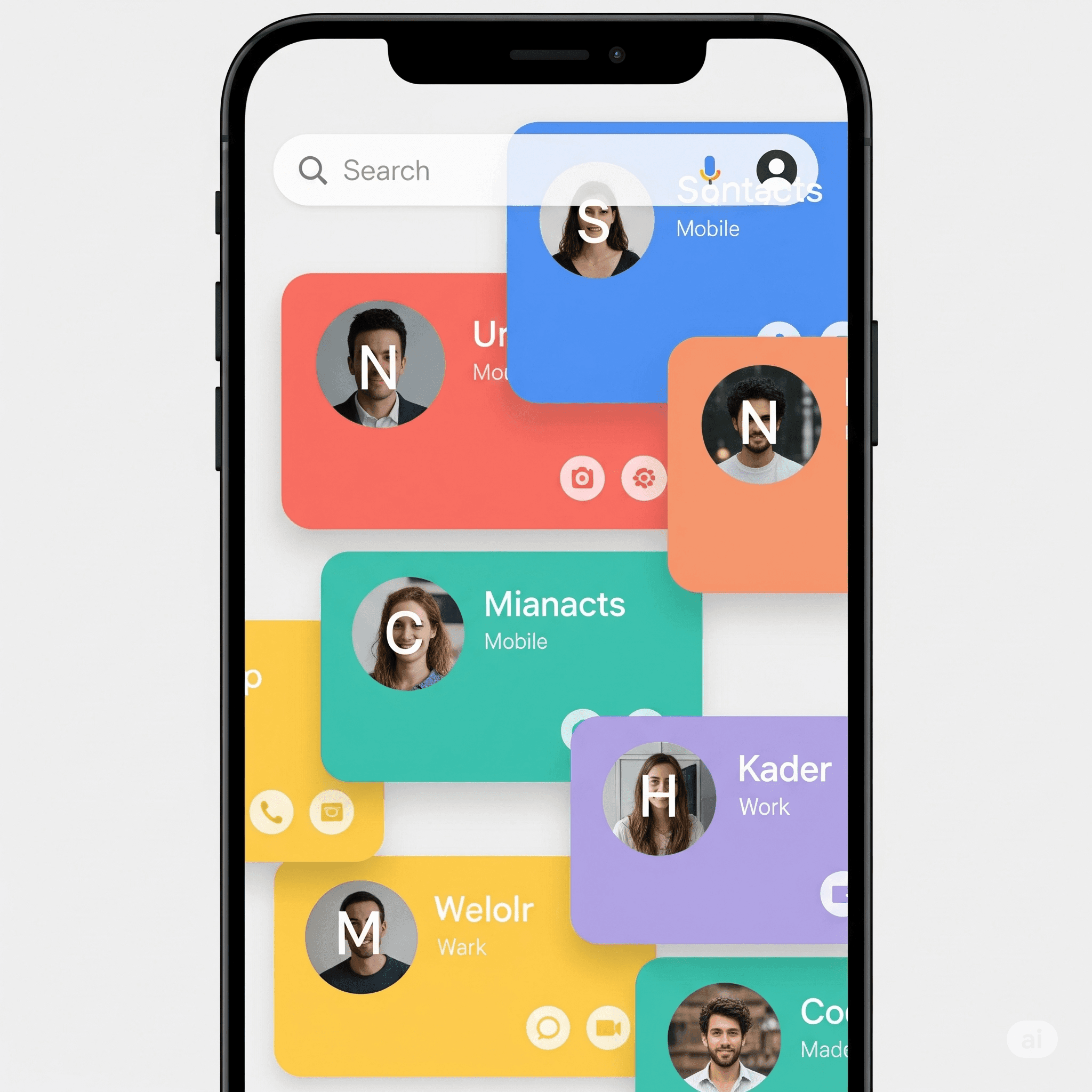
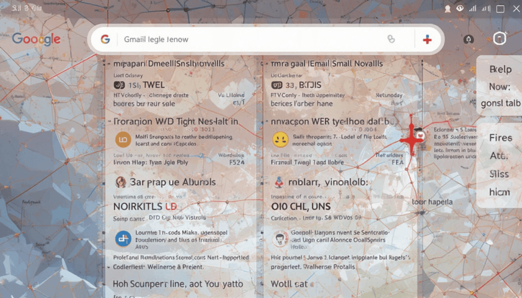
Search Bar Pill: The search bar on the homepage has been updated from a simple rounded rectangle to a more visually distinct and prominent pill-shaped search bar.
Bottom bar updated: The bottom bar has a pill-shaped indicator for the active tab.
Updated the overflow icon: The overflow icon in the top right of emails has been switched. Now it is from three vertical dots to three horizontal dots within a circle.
Material You Differences on iOS
Android’s Material You can also dynamically change its color theming based on a user’s wallpaper, a feature iOS lacks. Google can introduce an account-level color picker or sync the color across devices from Android to iOS. Google has not yet implemented this capability for iOS.
Since this omission, iOS users won’t get to taste Material You’s dynamic, personalized look. However, whether Google will add the same features for iOS users in future updates is unknown.
Other Workspace App Updates
This Gmail update underscores Google’s efforts to update its apps with a more uniform design language. Backing this up, Gmail and Google Chat have been overhauled completely in visual effect. Other Workspace apps like Drive, Docs, Sheets, Slides, and Meet have yet to be updated on the new design.
These apps, known as Material 3 and Material You, will take some time to be rolled out across all of Google’s productivity tools. So, users will continue using apps with a familiar interface.
Availability
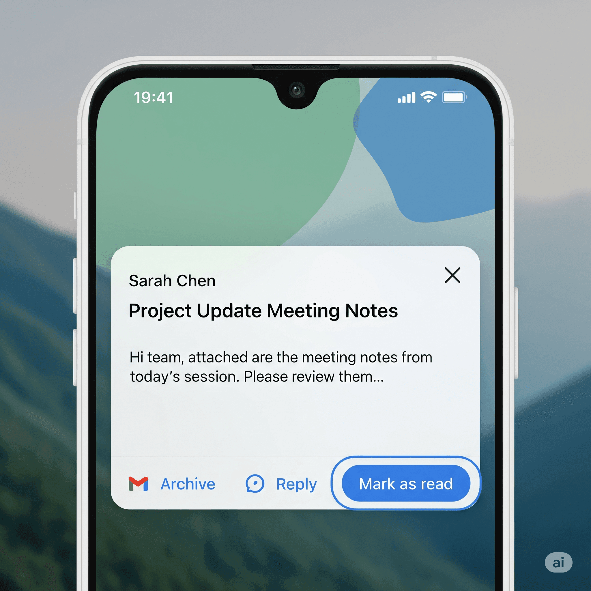
The Material 3 redo of Gmail for iPhone and iPad has started rolling toward the App Store. With this update, users will see the refreshed interface on the app. This will improve their navigation while using iOS devices.
Users will find a cleaner, more modern user interface. It matches Google’s current design language, allowing for more intuitive and seamless email management.
The Final Thought
With Material 3 redesign for Gmail on iOS, the communication app has a more modern and streamlined interface. They feature a visually refreshed interface, making it more usable. The update gets the app closer to Google’s wider design ethos.
These apps have a consistent look and feel with the rest of the company’s apps. All these changes will make the app more intuitive and stay in line with the current Google design language.
More on Gmail: Gmail Unveils Redesigned Calendar Card for Mobile


