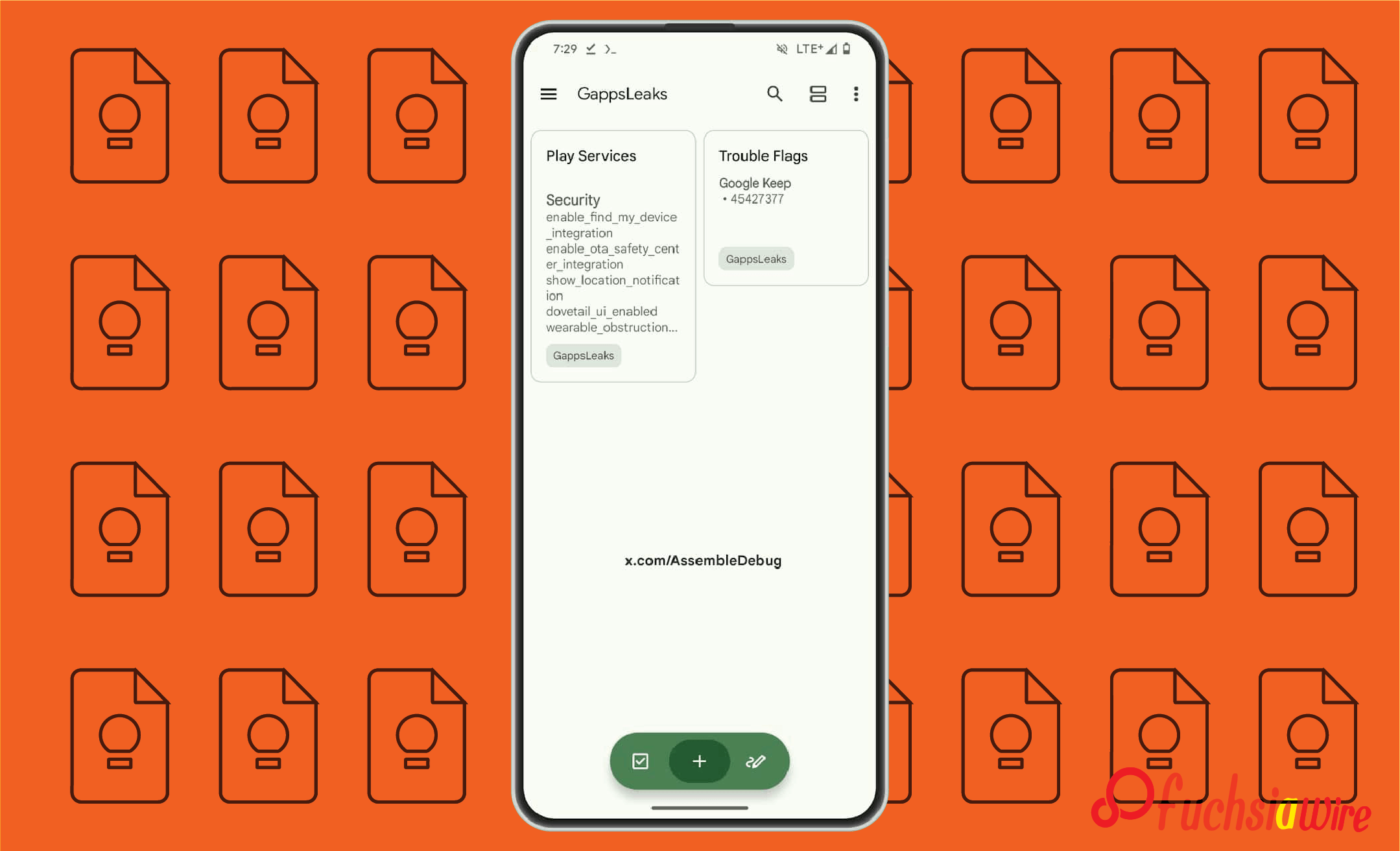
Some users ask, “ Does Google have a OneNote equivalent?” The answer is yes—Google Keep. The application is straightforward to use and does not have many buttons. Google is rolling out a significant change: Google Keep FAB Redesign.
The new FAB design makes creating notes more convenient. However, the design appeal is fresher and more structured in the interface. Previously, the button served a single purpose: to produce an empty note or list. With this new design, users of the FAB can easily access a broad range of note types.
Details of Google Keep FAB Redesign
The latest look of the FAB (floating action button) in Google Keep breaks from that inclination, coping with the prior single-tap functionality. In the current version, users can right-swipe on the FAB to unveil a circular menu with more focused choices.
It is a two-part process that is supposed to help users focus on note-taking and organize their notes more purposefully. If Google uses this feature, the app’s usefulness will rise significantly since it is the related note type.
With this new layout, Google Keep has an updated user interface. It provides quick access to new notes, all-note format, and other types of notes in a pretty, enticing manner. The linear menu gives the user a clear overview and keeps the layout of Keep very coherent with its design.
Step-by-Step Guide
Step 1: Tap and Hold the FAB
Press and hold the circular FAB at the screen’s bottom right. A circular menu will appear, displaying several note options.
Step 2: Choose Your Note Type
From the menu, select the type of note you want to create. Options include:
1. Text for quick notes.
2. Checklist for to-dos.
3. Drawing for sketches.
4. Image Notes for capturing photos or images.
Benefits of the Redesign
The new Google Keep FAB Redesign offers several benefits:
Reduced Accidental Taps: It eliminates taking notes when unnecessary. Only two steps are involved compared to one step in the traditional method. It results in note creation by accident.
More apparent Intent: Implementing a circular menu to decide the type of note is feasible. The circular menu helps the user select the new note type easily.
Streamlined Workflow: This redesigned FAB makes student note-taking less random and more selective. It also helps them sort out the notes easily.
Benefits of the Two-Step Process:
Enhanced Organization: Taking different types of notes helps users be more systematic with their concepts and ideas.
Improved Clarity: When the user selects the type of note they need at the start. He will not be distracted and confused by the rest of the options.
Greater Flexibility: The two-step process is convenient for users because it allows them to switch easily from one type of note to another.
Comparison with the Previous Design
The previous FAB design on Google Keep was a single-tap button on the right corner. It immediately created an option to enter new text. Though this was easy, it sometimes caused unnecessary clicks, especially for those who often used the side of the button.
The new design of FAB uses a two-stage action instead of the original three-step gesture when the circle is long-pressed. This change allows for more purposes for taking notes, eliminates accidental creations, and gives users more control.
The Last Verdict
Therefore, the latest update of Google Keep’s FAB option has brought a more purposeful and structured paradigm for note creation. After revising the two-step process, there are some positive aspects. It includes fewer provoking-by-mistake clicks, better intentions, and better organization.
It is anticipated that as Google improves the App and its user interface. We are also likely to see more and improved designs of FAB to support note-taking and increase the application’s efficiency.


