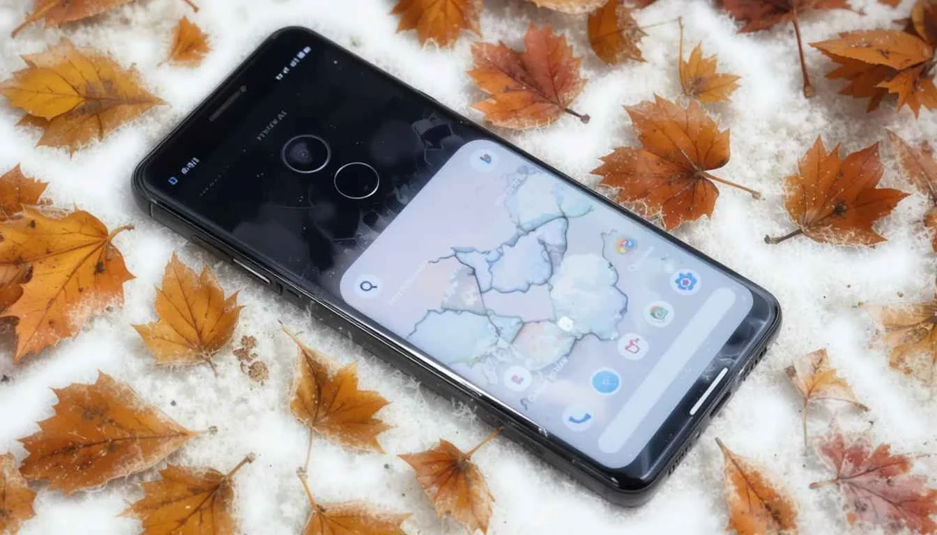
Android 16 QPR1 Beta 1 is now accessible. This represents a major move toward making the experience easier, more unique, and nicer to look at. Compiled with Material 3 at its heart, Lollipop goes further in dynamic theming and user-specific changes.
It aims to design an individual interface. This version puts forward the idea that your experience with the OS is adjusted by it. Here are 5 changes that special aspects of Android that are exciting me.
1. New quick settings menu
Quick Settings has been modified in Material 3 to look nicer and serve more practical functions. Now, the toggles become rounder when off and square when turned on. This gives users a pleasant and meaningful visual indication.
Customizability is by far the most important improvement they now offer. Now, you can resize Quick Settings tiles, so they take up just half the screen. That means you can now fit 8 shortcut tiles in the smaller panel instead of four. It gives you much better access to your top apps.
2. With the new At a Glance Widget
Enjoying this “At a Glance” widget on the home screen was always easy for Pixel users. It would take up quite a lot of room there.
The small change makes a big difference, so that we can showcase more apps and widgets in just one view. Although we don’t usually see all the home screen icons, those who do will be pleased with how easy it is to read the info.
3. Vibrant new animations
They don’t only look nice; they also help make daily interactions more pleasant. For instance, a notification you swipe away will cause the other notifications to react softly, just like a wave. If you swipe an app out of the recent apps menu and then drop it, the app flies back.
This makes the next card cards bounce fractionally. These short physics animations help the system feel smarter, so common tasks become little joys.
4. A Reorganized Lock Screen
You can now clearly see more information and updates right from the lock screen. With no notifications, the information on the date and weather is smoothly moved below the clock. This makes everything look more organized and neat.
If you’re using lock screen notifications, the new feature hides them. So, they are just small app icons on your lock screen. Google’s version of this matches Samsung’s One UI but goes a step further. Now, you can quickly spot if you have received alerts, without information that is not needed dominating the screen.
5. New Icons on the Status Bar for Easier Understanding
Your device’s status bar which is always there, has become even more interesting. The design of both Wi-Fi and mobile data indicators has switched from a solid, flat shape to distinct, segmented parts.
As a result, it’s easier to tell where you are in the message. That way, you can quickly know how much power is left in your phone. These icons make it easier and faster to realize what your phone is doing.
Conclusion
The new Expressive changes in Material 3 bring a big change to the Android user interface. These visual improvements also result in a smoother, simpler, and more personal experience for users.
Changes to Quick Settings, as well as the new visuals and adjusted status bar, help make Android more alive and enjoyable to use beyond looking nice. We look forward to discovering how these changes emerge and enter into Android’s total ecosystem with each beta update.
Also Read: Google App Gets ‘Activity’ Tab on Android
