


The Google Phone App Material 3 update is bringing a major redesign to the dialer experience. With the arrival of the streamlined and modern Material 3 Expressive design, the Google Phone app is set to feel more cohesive, intuitive, and visually aligned with the latest Android interface standards.
The company is also experimenting with new swipes to receive or decline calls. There is a strong emphasis on developing the fluidity and ease of operation of the phone. It is one more update in Google, striving to align its applications in a single unified modern design.
What is Material 3 Expressive?
It is the latest modification of the Google Material Design framework, expanding on the concepts introduced in Material You, which focused on dynamic color themes based on your wallpaper. The Material You Expressive Redesign takes this vision even further, offering a more personalized, flexible, and ownable user experience across Android devices.
It brings richer and more customizable color schemes, which makes the interface look customized. New contours and expandable elements are also an addition to Google. Concisely, Material 3 Expressive makes Android one more step closer to being finally personal, flowing, and user-friendly.
Key Changes
Material 3 Expressive redesign is an array of visual and functional improvements to the Google Phone app:
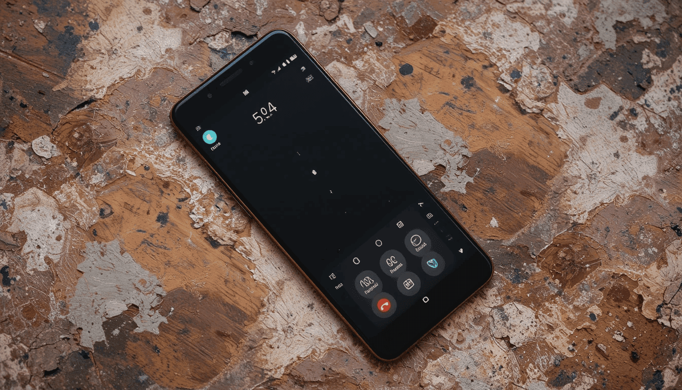
Redesigned In-Call Screen
The main scope of changes is presented in the active call screen.
Bigger UI Elements: Buttons, contact names, and the photos of the callers are much larger and noticeable. This became better during a call because it is easier to glance at.
Pill-shaped Buttons: The age-old call-to-action buttons are being changed to some more advanced types that are in pill shapes. These tablets are so good that even a mouse choosing them can change their form to plain, rounded rectangles.
Large End Call Button: The end call button has been made wider and more visible. It becomes more accessible to find and press.
New Incoming Call Interface with New Gestures
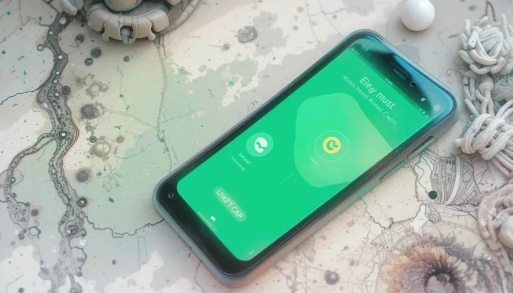
It also involves a major change of functionalities, where there are options for getting incoming calls:
Single Tap Gesture: The choice allows clear, large Answer and Decline buttons. The users can easily tap in order to communicate during the call.
Gesture: Horizontal Swipe Gesture: This adds a pill-shaped slider to the incoming callscreen. The middle physics button can be swiped to accept or decline. This gives a more human and graphical feel to the action.
Shape: Even the screen of the incoming call can have a light, dynamic shape of scalloped material 3. However, it rotates until you do something on the screen, which is another way to have meaningful visual spice.
Information that is pill-shaped: “Urgent?” and the options of Message are installed, also, in clear pill-like containers.
Tab and list update
The tab is called Recents and has also got a facelift:
Rounded Corner Cards: Separate call log entries now appear in rectangular cards with rounded corners. It allows decreasing the clutter of the list and makes it more modern.
Textural contrast: The background of the recent calls list could be a minor textural contrast of color. It will aid in differentiating it from everything.
Community Consistency Between Sections: This style has also been extended to other sections of the app, including the dialer screen and especially the Favorites screen. So, visual language is used consistently across all sections.
More Caffeine and Settings
Subtle, but effective design changes go through to other sections of the application:
Newer Filters: Filters such as All, Missed, Contacts, Non-Spam, Spam, etc., are now updated. Especially in terms of design, it has been based on a more integrated version of Material 3.
Expression in Settings: The primary settings list follows the new design postulates as well. It creates a unified experience of aesthetics.
Availability and Rollout
Material 3 Expressive redesigned Google Phone app will be distributed soon to the beta channel users. This would occur through a server-side update, so not all beta users will be on it instantaneously.
These changes are already appearing on some Android versions. They represent the wider Material 3 Expressive rollout that is expected in Android 16. Like most Google releases, a broader stable version is expected to be available in weeks or months to come.
The Wider Implication
Such redesign of the Google Phone application is a part of a greater movement. Google is gradually redesigning its most essential apps to match the Material 3 Expressive vision of design.
We witnessed this kind of rollout with Google Maps, Google Messages, Gmail, and Google Photos, to name a few.
This more consistent approach aims to have a more cohesive, modern, and amusing user experience across the whole Google environment on Android.


