


Android users, prepare to have a new look of Google Keep Material 3 Expressive! The redesign is planned to be completely functionally compatible with the next Android 16. So, you can expect this interface to be much more interesting and accessible.
The update implies a slight modification, but the overall redesign of Google Keep. This aims to make it feel new, with a new look, a new search bar Google Keep redesign.
Material 3 Expressive: What & Why
Material 3 Expressive is a specific turn to more musical, human, individual graphics. The new design language focuses on big things, colorful elements with a dynamic and changed according to wallpaper. It has done with the help of Material You, and more personality in the interfaces of apps.
A vigorous research has been conducted by the design divisions at Google to come up with this evolution. It has been reported that Material 3 Expressive has taken the place of more than 46 design cycles. The option received feedback from more than 18000 user participants.
What Changed — Google Keep Specifics
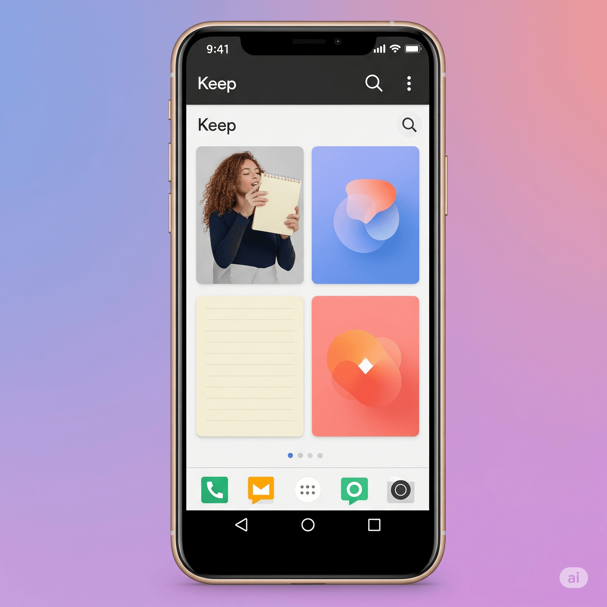
The Google Keep redesign for Android has already started coming out bit by bit. The stage versions v5.25.252.00.90 and v5.25.282.00.90 are two of the turning points. Take a closer look at what the UI element changes are going to be:
Bigger Search App Bar: The search bar at the top is now bigger and taller. Therefore, it is now easier to use and find.
External Hamburger/Profile Buttons: The Navigation menu and profile button are no longer inside the search bar in the middle; instead. They stay in the top corners to better stand out.
Large and Circular Toolbar Buttons: Toolbar buttons on the major toolbar are now considerably bigger. They are set inside rather well-defined circular containers that enhance tap targets and visibility.
Note Buttons in Containers: Buttons related to specific notes are now vidiblr in distinct containers. This makes them more visible as well as easier to interact with them more easily.
Three Dots Overflow Pill Shapes Menus: The overflow menus (three dots) have changed to a pill shape. They are like all of Material 3’s Expressive visual language.
Layout Relocation: This may not be visibly obvious at first. However, some of the formatting places could experience minor changes in order to fit the new interface better.
Broader Rollout: Other Google Apps & Android Settings
The redesign of Google Keep is one of the several projects. This aimed at putting Expressive design in Google apps into the limelight. We are already experiencing such a direction in the case of different Google services and the Android 16 user interface redesign.
The other well-known Google apps have started integrating the aspects of Material 3 Expressive as well. This is a single design language. It will help to establish a more familiar, even a beautiful, look across the whole Android ecosystem.
Usability & Accessibility Impact
The research done by Google on Material 3 Expressive has not only been to make it aesthetically more appealing. However, it also aims to make it easier to navigate the Android app. The users can find the critical contents in such re-designed interfaces as much as 4x faster.
Interestingly, they also show that older users reflect the same levels of comprehension speed as younger users on the Expressive interface. This implies that the brighter visuals do contribute to accessibility by a greater number of users.
User Sentiment
Preliminary user feedback on the Google Keep redesign has been mixed, but leaning towards the positive. According to a poll conducted at PhoneArena, 59.7 percent of users are fans of the redesign.
There are also forums on the internet, such as Reddit, where consumers share their comments on the new appearance. There are several praising the new appearance. Some are getting used to the variety of alterations in the layout and icons.
Author’s Verdict
The implementation of Material 3 Expressive in Google Keep is not only a superficial change. It is also the deliberate move of Google to make the product more engaging and personal to make. This makes it more appealing to the consumer, especially the youth.
The absorption of clean minimalism to expressive visuals with usable functionality is indicative of a different path towards the design language in the Google ecosystem.
What to Watch Next
Whether we mean exactly the upcoming stable release of Android 16. Or the full kick-off of Material 3 Expressive, the results are likely to become more visible.
We are also keeping an ear out for expanded Pixel launch plans with the redesigned Google Keep. And of course, there are further adoption of Expressive functionality on other critical Google software.
Event types such as Google I/O will most probably present more information about the future of Google’s design vision.
FAQs
How soon does this appear in Keep?
The update is released in stages. Make sure you have the latest version (v5.25.282.00.90 or newer) of this app through the Google Play store. Occupancy can be different based on your device and location.
Is it Android alone?
This is the first significant redesign. The one aimed at the Android application, which follows the Material 3 Expressive movement on the system. Keep web and other updates will probably follow.
Where does Material You go?
Material 3 Expressive is a development of Material You. Dynamic color schemes grounded on your wallpaper are likely to remain one of the significant aspects of customizing the appearance.
Does it have an effect on app performance?
Google has focused on the ability to make sure the visual improvements do not adversely affect the app’s performance. It has been all about enhanced usability and aesthetic value with no reduction in speed or efficiency.


