


Google is continuing the process of redesigning its app suite towards a unified and modern design language. The update, with version 8.1, brings a full Material 3 Expressive Redesign.
It makes one of the most fundamental tools of Android – alarms, to the stopwatch – more human-readable, more intuitive, and engaging for users worldwide.
What is changing in the New Google Clock?
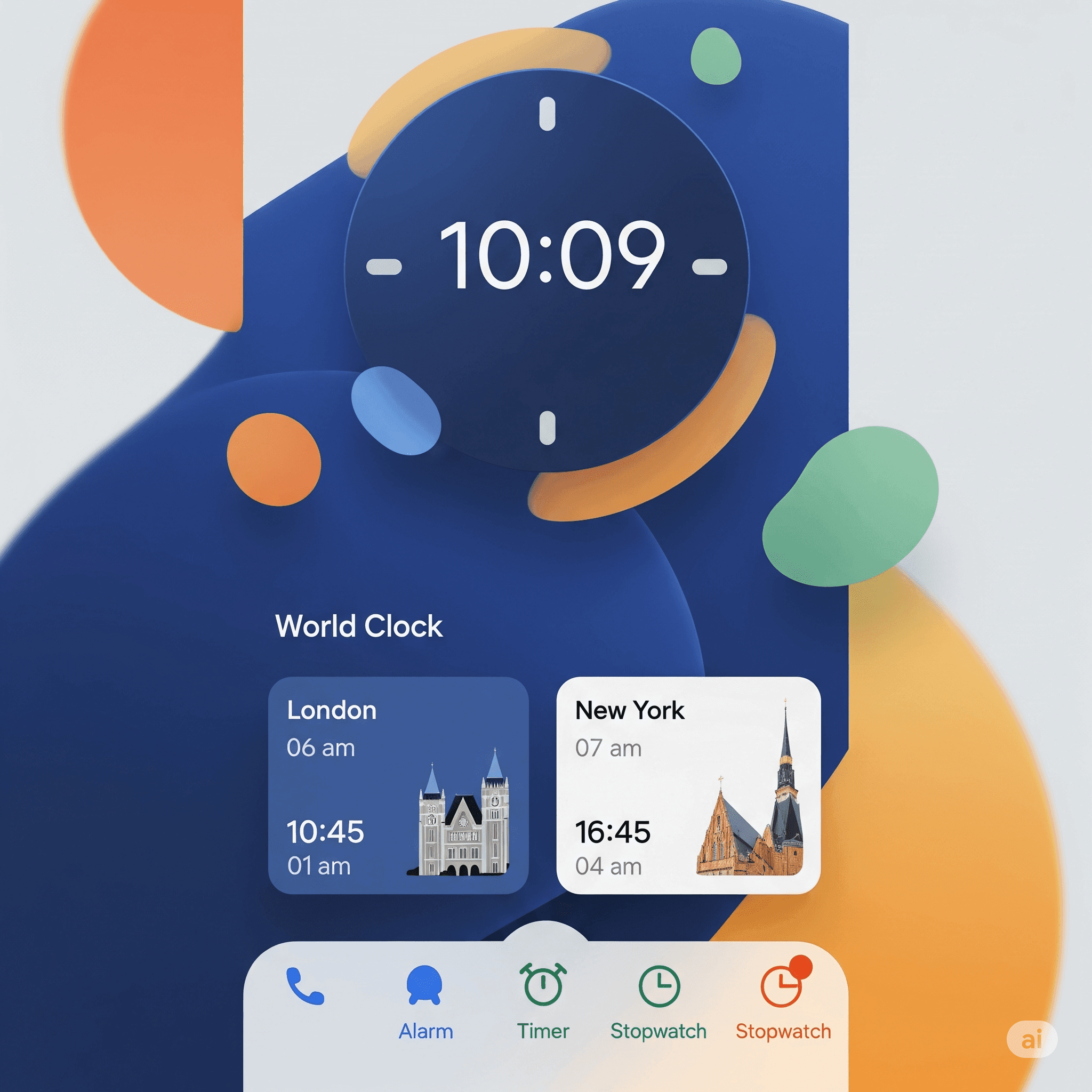
First, perhaps the most obvious, is the dismissal of the long bottom bar and circular Floating Action Button (FAB) found in the old UI. The app has a new streamlined and more conscious design that focuses more on clarity and usability.
New Appearance of Alarms:
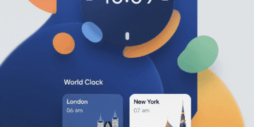
The Alarms tab has been changed with a complete background highlight of active alarms. Rather than just utilizing a toggle or bolded text, use the simple visual indicator of a different, color-coded background on which to print the confirmation of those alarms.
Tapping an alarm presents it in a smooth sliding sheet to edit the info, which is a much cleaner solution than the inline interface it replaced.
Redesigned Alarm Interaction:
The snooze and stop would be separated, no longer being lumped together in one often unreliable slider interaction.
There are now two separate buttons, so it is much less likely to accidentally dismiss when you meant to clear.
A personalized touch would be that the background of your phone is visible behind the ringing and sounding of alarms.
New Style Stopwatch:
A New and improved design has been made on the stopwatch. The stop, reset, and lap buttons have become substantially larger and are thus simpler to hit in the correct location.
The lap times no longer appear in a general list; they are presented in a set of neat cards now, making them far more legible.
Tablet-Optimized Navigation: The navigation system has been placed into a convenient rail on the side of larger-screen devices such as tablets. This will allow the app to be simple to navigate and operate with larger displays, and the main action button will be found at the very top of the interface.
Entering the Bigger Picture: A Unified Ecosystem
This update to Google Clock coordinated with the goals of Google to harmonize the user experience of its entire app set.
Google Keep, Find Hub, and Google Calculator are just a handful of apps that have recently undergone this Material 3 Expressive redesign makeover over the last few months.
Such a systematic rollout promises to form a more pleasing, consistent, and intuitive Android ecosystem, where apps not only appear visually consistent but also behave similarly.
Powerful colors, smooth movement, and the emphasis on shapes and positioning are used in the new design to draw the eye of the user to the main stages of the interaction.
By applying these trends of modern design to an application as fundamental as the clock, Google is sending a message that it is serious about refining every element of the user interface of Android devices.
How to Update
Google Clock is designed to give you the ability to wake to your favorite music or fall asleep with white noise to help deal with the stress and relaxation that comes with it.
And in case you have yet to get it, you can manually search for an update to the Google Clock app in Google Play.
When updated, the new Material 3 Expressive design will turn on automatically, introducing a new, fresh, modern look into your everyday lives.
Conclusion
More than a nice facelift, the Google Clock 8.1 update is a testament to Google’s commitment to delivering a usable and cohesive design across its platform.
Improved navigation, simplified interactions, and optimisation to suit any device make time management on Android work and visually pleasing.
Google is steadily introducing Material 3 Expressive redesign to a growing number of applications, so users can expect that Android will continue to become more unified and refreshingly modern.
FAQs
What is the coolest thing about the Google Clock 8.1 update?
The most significant one is the new Material 3 Expressive design, which includes a new, modern, colorful, and friendly user interface, and enhances the User Experience concerning alarms, stopwatch, and navigation.
Are there some new functions in the alarm area?
Active alarms are now highlighted with a colored background to make them more visible, and editing an alarm will open a clean sliding sheet. Snooze and stop buttons have been separated to make them easier to use.
Is the update better on the tablets?
On wider monitors, the navigation bar will be placed in a lateral panel, therefore easier to use on tablets and other large screens.
Is the Google Clock redesign available on all Android devices?
It is already published on the Google Play Store and is being delivered to all the regions worldwide, but the availability has been different depending on the regions and the device.


