


Google Maps has made a small but visible change, the Bottom Corner Logo to its mobile map. The multicolored Google wordmark in this space has now been changed to a simple “Google Maps” label.
All map views on both iOS and Android offer the new design now. Google mapped the looks of the Android app to iOS to create a clearer one without making the app Busy.
A Change to Simple Branding
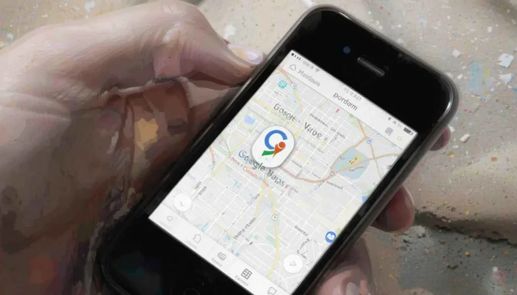
Before, the bottom-left corner of Google Maps showed the Google logo in four colors, often bordered in white. This Google branding is very popular. It could sometimes stand out too much, especially when the maps take up the whole screen.
Google Maps’ updated logo consists of monochromatic text spelling out the name. It reflects the user’s device theme.
The branding now matches with other Google software. It prefers to use product-specific logos in place of the main company logo where users interact the most with the app.
Reduces Distractions, Gives You More Focus
The major advantage of this tiny tweak is a user experience that is both cleaner and less cluttered. In Google Maps, what you see on the screen reflects the whole look and feel of the app.
Giving the Bottom Corner Logo a simpler look helps users concentrate more on the content of the map. The absence of the colorful company logo is a beneficial change for a lot of people.
The brand looks consistent across all platforms
Many people using Android and iOS devices have noticed that the new logo has rolled out. But Google Maps on the desktop is still using the classic logo instead of the new one.
Because of this, a staged launch might be wise, or deciding to improve the mobile app first since its screen is often larger.
Part of the Bigger Pattern of Design Changes
Google is taking to improve Material Design and keep its brand identity the same across many types of products. Google has recently added other updates to Maps, including having a simple navigational bar.
The main Google app’s “G” icon was updated in May 2025 with a new gradient appearance. It marks another step for Google in using one look across all its products.
The new Google Maps logo in the corner of the app was a choice. As the update rolls out, people can notice the change on their devices.
The Climax
The updated Google Maps Bottom Corner Logo in the lower left seems small. It is part of Google’s push to tidy up its apps and emphasize each product’s brand image. The company wants the logo to be less distracting and enhance what the users see.
Google upgrades Material Design for all its apps to help unify and polish the entire mobile experience. This design change will spread to additional devices after the update starts to be released more broadly.


