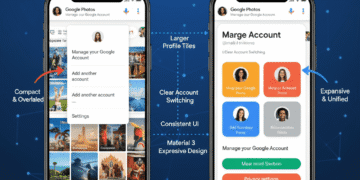


Google is also implementing a significant user interface modification to its core Android applications; the traditional small drop-down account menu has been replaced with a full-screen version.
The new layout may already be seen in applications such as Google Photos, the Play Store, and the main Google application. It offers a more reliable and engaging experience when switching accounts, managing profiles, and tapping into settings.
This remodeling not only simplifies usability but also mirrors the overall direction toward which Google is moving its apps to match the current, visually bold Material 3 Expressive design language.
A Larger, Greater Account Experience
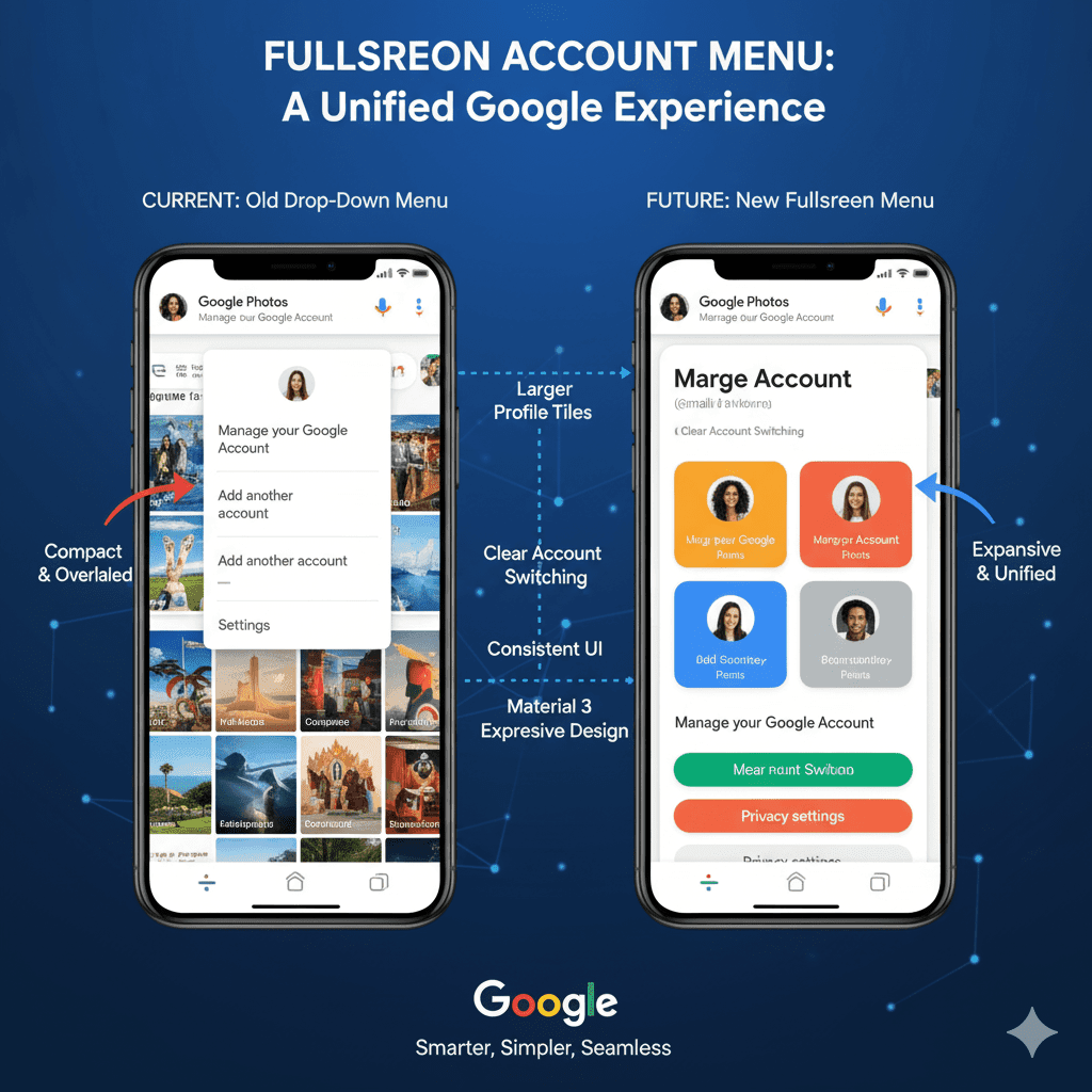
The transition to the full-screen account menu is offering some important advantages, as compared to the previous, sometimes tiny, design.
Enlarged Real Estate: The full-screen takeover provides enough room to show all the account-related options in an uncluttered manner. This will minimize scrolling and provide simple access to certain settings or profiles.
Better account switching: If you have more than one Google account (e.g., work, personal, or other accounts), the new menu displays each account in larger and more identifiable visuals. This makes it easy to alternate between them.
Other Profile Management: Other options, such as: Manage your Google Account, the addition of another account places significance on their appearance. They can be visible instantly without using any navigation.
Consistent Design: This full-screen design is the approach that unifies account management experience across several Google applications. It also guarantees a common appearance and feel, whichever app you are in.
Rolling out in major Google Applications
The full-screen account menu is joining an expanding set of the most-used applications in Google:
Google Photos: The Thefull-screenn menu to manage backups, sharing preferences, and account preferences now appears in the profile picture of those who access Google Photos.
The Google Play Store: The account section of the app store also has this new appearance, and it is more convenient to control subscriptions, payment options, and app library in various profiles.
Google App (Search): The primary Google search app has its new full-screen account manager, which provides a single entry to many services or settings of Google.
Other Apps to Watch: This design will hopefully eventually spread to other big Google applications. This encompasses Gmail, Google Drive, and Google Maps, making the user experience across the ecosystem the same.
The gradual implementation of this shows that Google is willing to have a single design throughout its product range.
Why the Fullscreen Shift?
The move to a full-screen account menu is a strategic design choice by Google. The new design adheres to the rules of Material 3 Expressive. It focuses on more prominent visuals, better division of elements, and a more interactive interface.
In addition, the full-screen design makes the menu future-proof. This allows it space to be expanded with more functionality or to integrate any future Google services, but not overcrowd the interface.
By placing the entire screen on account management, Google has become a user-controlled platform, enhancing the importance of the user taking charge of their data, privacy settings, and even the overall Google experience. Overall, this is a measured progress towards a visual and user-friendly design.
Conclusion
Bringing full-screen account menus to Google Photos, the Play Store, and the Google app is one of the key milestones in the history of Google design.
Making the visual elements of the small drop-down larger and more manageable will also make Google appear more readable, easy to handle, and reinforce the cohesion of the user experience within its ecosystem.
This update does not just comply with the modern Material 3 Expressive design. However, it also provides its users with a greater level of control and far simplified access to their Google profiles and settings.
Frequently Asked Questions
Which new menus are being added to what Google applications?
The first applications to receive such an update are Google Photos, Google Play Store, and the main Google application. More apps will likely follow.
What is the rationale for having the account menu full-screen at Google?
The full-screen design enables greater legibility. This makes it easier to switch between accounts and fits in the existing Material 3 Expressive design language of Google.
Does the update make switching among Google accounts challenging?
No, it makes it easier. The larger interface will be displaying multiple accounts in a better way. The process of changing books will be easier.
Does this new menu alter my access to the settings of my Google account?
No, it only alters the ways the options are shown. Other settings, such as “Manage your Google Account,” are more visible.
Is the change being implemented for Android and iOS?
Google normally wants cross-platform consistency, although mostly only Android is affected first.
Do I have to update my apps in order to get this feature?
This is commonly a rollout on the server side. It may also show up without a new update of an app. This is always a good idea to update your apps.
What is the design of “Material 3 Expressive”?
It is the new design language at Google. It focuses on bold images, clear shapes, and an attractive, user-friendly interface.
Does this update impact my privacy settings?
No, this is an interface change, not anymore. It will not change your privacy settings, but perhaps it will simplify them.
When will I be able to see this new full-screen menu in other Google apps?
Google implements design changes slowly. It will spread to additional core Google apps in the next few weeks or the next few months.


