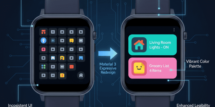
Google Material 3 Expressive Redesign language is also finding its way to smartwatches and is giving Wear OS a new and cohesive feel. This colorful redesign is appearing in major applications, and the Google Home app and Google Keep are among the first applications to be visually reinvented.
The refresh adds a coherent, contemporary look to your wrist, with more bold, colorful, and better definition. Not only aesthetics-wise, it makes the Wear OS more readable on small screens. This makes it closer to the overall design ecosystem by Google.
The Material 3 Expressive has a New Look on Wear OS
Material 3 Expressive adapts the most recent design principles of Google to the smaller screen. It seeks to render communications more natural and more graphic.
Rounded Elements: Apps have become straightforward and simple-looking in their components. The buttons and information cards have clearly rounded edges. This simplifies the tapping and reading of elements.
Bright Use of Colour: M3E introduces a brighter colouration. Colors are usually bold, and this increases the visual interest. Wear OS is also the receiver of dynamic Color support.
Fluid Animations: Interactions are more interactive and fluid. Minimal animations give more feedback on tapping or swiping.
Better Readability: M3E is more focused on readability, even though it is designed in a bolder style. This facilitates easier consumption of information as a preview point on a small screen.
Wear OS Notebook: Google Home App
M3E redesign is very advantageous in the Google Home application. It changes the way you command your smart devices in your home using your smartwatch.
More defined Device Tiles: The smart home devices now have a more defined, rounded tile. This simplifies the process of finding and communicating with single lights, thermostats, or cameras.
Improved Information Display: Major device conditions are better shown. They can immediately be seen on the smaller screen.
Minimized Controls: Tap controls used to turn on lights, air conditioning, etc., are bigger. This eliminates false squeezes on the watch face.
Shared Visuals: The Wear OS app is now similar in appearance to the redesigned Google Home phone app. This produces an integrated control experience.
Google Keep on Wear OS
Wear OS has received a major M3E update for Google Keep, the popular note-taking app. Notes and lists now appear in separate rounded cards, making items easier to distinguish visually. List item checkboxes are larger and easier to tap, with a stronger presence, and completed tasks are displayed more clearly.
New typography makes the titles and the content in the small watch display easier to read. Moreover, color-coded notes are more vivid, with users being able to easily recognize notes and group them accordingly. The redesign of the M3E makes Google Keep on Wear OS even more useful to look at every minute or two and communicate simply.
Conclusion
The launch of Material 3 Expressive redesigns to Wear OS applications such as Google Home and Google Keep is a significant move in Google’s effort to ensure continued design consistency and a sense of modernity. Google boosts usability and visualization by introducing more daring images, crisper details, and smooth motions to the smartwatch.
Not only has this update made these primary applications much easier to use on a small screen, but it also harmonizes the experience that users have throughout the larger Google ecosystem. It is also an indication that Google is planning to refine Wear OS to a more refined and competitive smartwatch platform.
FAQs
What is Material 3 Expressive (M3E) Wear OS?
M3E is the new design language in Google. It promotes more graphic visuals, brighter colors, and flatter animations to Wear OS apps.
What Wear OS applications are getting M3E redesigned?
Google Home app and Google Keep are among the first applications that are rolling out with the M3E redesign.
What are the key visual differences in M3E on Wear OS?
It will require high-profile, rounded features, bolder colors, and flowing animations to appear more contemporary.
What advantages does this redesign of Wear OS have for Google Home?
It will improve the clarity of device tiles, provide more detailed information display, and simplify the control to easily manage the smart home.
Does the new Google Keep design make it easier to read?
It utilizes separate note cards and better typography. This simplifies the process of reading notes and lists.
Does M3E have an impact on my interaction with my smart home using my watch?
It is more intuitive to interact. The big tap targets and easier status leaves help to lower the mis-taps.
Does this update of M3E apply to every Wear OS watch?
These updates will usually be available on watches using a recent version of Wear OS (e.g., Wear OS 3 or above).
Do more Wear OS applications have a higher likelihood of receiving the M3E redesign?
Yes, Google seeks to have design coherence in its ecosystem. More Wear OS apps will receive M3E updates.


