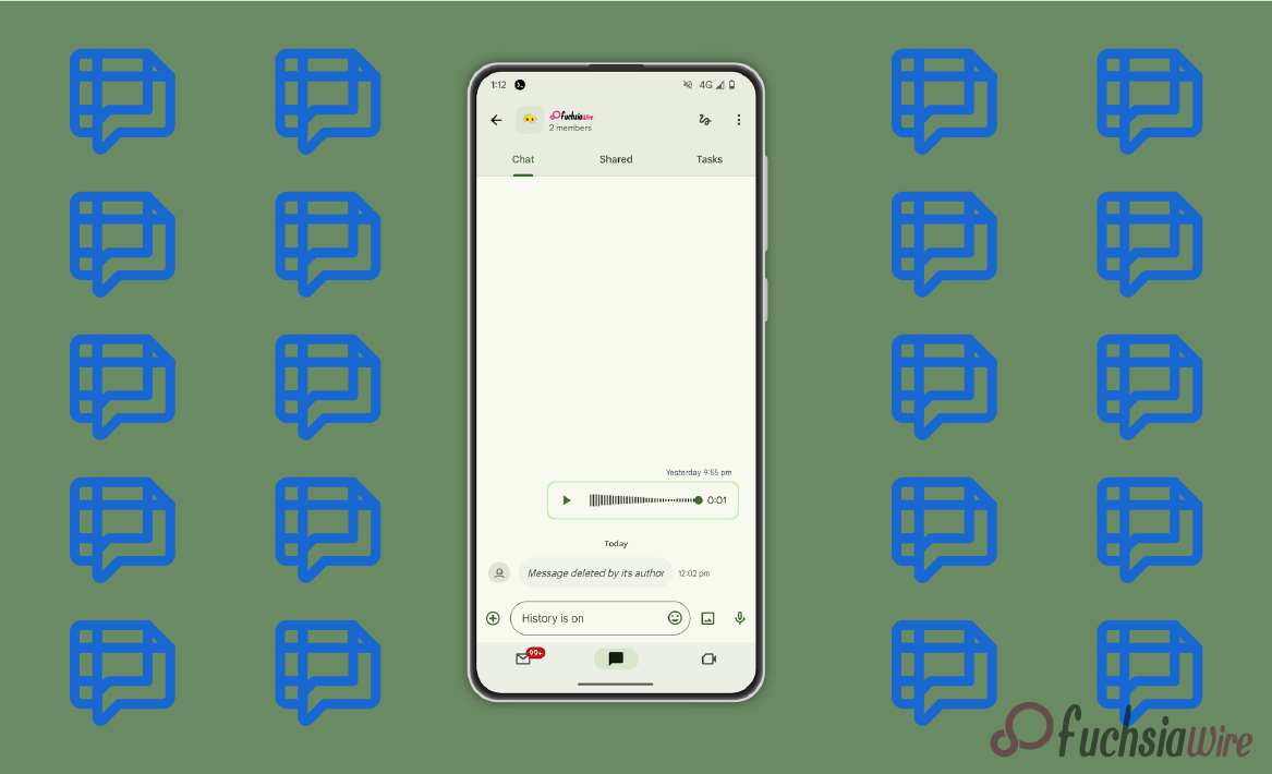
The Google Chat’s Floating Bottom Bar, commonly known as the ‘bottom bar,’ is a common UI feature. It is designed using Material You design principles to enhance usability. The bottom navigation reduces clutter in the menus by placing commonly used actions at an accessible point.
Material You significantly enhances the bottom navigation with a responsive design. It provides a seamless platform experience and improves user interaction.
The New Design of Floating Bottom Bar
The floating bottom bar has been redesigned to optimize interaction with the app. As expected, the new design comes with new features:
More Understandable Bottom Bar Changes:
The developers made changes to enable the inclusion of more aesthetic bottom icons. Bottom icons have been changed to illustrate specific functions and clearly show what they do, making understanding bottom icons easier.
Revised Icon Order:
Increasing the prominence of certain features on the bottom bar has led to significant changes in their placement. Its UI has improved dramatically, highlighting accessibility and ease of use. This means that users do not have to search for the actions they want by scrolling through many menus.
Dynamic Theming:
The lower bar changes its style dynamically according to the user’s selected theme or system settings, which is more consistent. This makes the bottom bar even more user-centered. It fits perfectly with other parts of the app, enhancing user experience.
User experience improvements
Google Chat’s newly designed floating bottom bar has dramatically improved navigation and usability. Users do not have to wander around the menus looking for a feature. This is because the updated iconography and redesigned structure allow quick recognition and access. Furthermore, dynamic theming and adaptive layout quality allow for providing the same aesthetic bottom bar across multiple devices.
The recent changes in terms of accessibility address the concerns of users with disabilities. They do so by including features such as large, easy-to-tell icons alongside assistive technologies support, simplifying app navigation. Also, your design material provides integrated building elements. They create a more attractive and consistent interface that is coherent with the designs of other Google products.
All the abovementioned changes work together to ensure the user experience remains consistent and enjoyable. Therefore, users will have no difficulties engaging with Google Chat and completing their objectives.
Rollout and Availability
Google Company is phasing in the new floating bottom bar in full width to have it available in weeks to all users on various devices and geographical regions. This ensures that users can address potential problems or concerns before a large-scale implementation. The availability might differ depending on the device type. It operates system versions and carrier networks, meaning some users may be late updating.
This might be due to some users not having updated to the compatible model for the redesign. This device will be implemented across various business platforms. The redesigned floating bottom bar is one of the first fundamental changes related to the overall design upgrade that Google is working on. Material: You will always center this design around the individual users and streamline it.
The changes in this scope simplify navigation by ensuring that frequently used actions are within reach. Decreasing overall usability regardless of whether users are on Android, iOS, or web platforms. This complex menu structure is designed to improve user satisfaction, increasing the visual experience in combination with more menu pieces.
Comments from Users
The initial impression of the modified floating bottom bar has been relatively viral. Many users appreciated the new icons, which made navigation more accessible and the entire interface more attractive than before. Many participants reported that the new bottom bar has streamlined the process of locating and performing actions. It fosters their experience while using Google Chat.
The post-update results in user ratings, and user activity is believed to be well delivered. According to Google, by creating an interface that suits the needs of most users, the number of users who use Google Chat will improve. They will feel more connected with one another.
Conclusion
The redesigned floating bottom bar in Google Chat is a giant leap forward in design, scope, and user engagement. The icons’ reorganization, the pages’ modified structure, and the employment of Material You elements enhance Google Chat’s overall aesthetic appeal.
For those of you who have not done so yet, feel free to test the upgraded bottom bar. Users must appreciate its advantages. After this update, Google Chat integration will allow you to communicate more effectively with friends, family, and co-workers.
Related Reading: Googlе Chat Adds Support for IFTTT Intеgrations
