Google Wallet is getting a fresh new look, with the Material 3 Expressive redesign now rolling out to a wider range of users. This refresh adds a fresh, contemporary feel to the digital wallet application and makes it more aesthetically appealing.
The redesign centers on more specific designs, deeper colors, and more animations that alter the interaction between the user and their cards, passes, and tickets.
The Expressive New Look of Material 3
The Material 3 Expressive (M3E) update brings a number of updates to the visual appearance of Google Wallet.
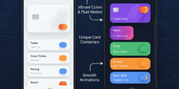
Bright Card Containers: The cards, passes, or tickets now reside in their own transparent, rounded container. This brings personal items to a higher degree of separation.
Bright Color Palette: The redesign also has a more diverse and saturated color palette. This gives it a more lively and individual appearance in the application.
Refreshed Icons: The most important action icons and navigation elements are updated to the modern picture. They are in the expressive, a little more aggressive style of M3E.
Smoother Animations: Interactions in the app are smoother and natural. There is a new animation in the visual feedback on the process of tapping or swiping.
Concentrate on Clarity: In spite of the more aggressive style, M3E is targeting better readability. It simplifies the process of finding and choosing the right card or pass in a short period of time.
Key Areas of the Redesign
The redesign of M3E also affects some of the most important parts of the Google Wallet application.
Home Screen Layout: The primary screen with the main payment card is tidier. It includes a focus on card information and simplicity in directing payments.
Passes and Tickets: The new containerized design is beneficial for storing loyalty cards, event tickets, and boarding passes. The visual separation of each item is increased.
Bottom Navigation Bar: There is a slight update to the bottom navigation bar. It employs the newer icons and a slightly stronger background.
Transaction History: This view of transaction history is more structured. The new container style is seen in many individual entries and makes them easier to read.
Google Wallet requires this update
The mass deployment of the new design of Google Wallet reflects how the company has been strategically oriented towards empowering its digital wallet platform. The new, image-based interface can make the process more pleasant and popularize the use of digital payment by making Google more user-friendly and modern.
Making sure that the design is aligned with the Material 3 Expressive also makes sure it is consistent with other recently updated Google apps, providing a more integrated ecosystem.
This is a refined redesign, which gives Google Wallet a competitive advantage in a saturated market of digital wallets, with the product having a high-quality feel that differentiates the product.
Simultaneously, the Material 3 Expressive framework is a future-proofing of the app, which simplifies the inclusion of future features and innovations. All in all, this update solidifies the role of Google Wallet as the most important utility in processing both digital payments and passes.
Conclusion
The wider adoption of Google Wallet Material 3 Expressive redesign provides a major visual boost. The use of vibrant color, unique containers, and flowing animations has now made the app more modern and interactive to the user.
This new update not only makes the app more visually appealing but also improves readability and further unifies it with Google’s design ecosystem, making digital transactions more convenient and enjoyable for everyone.
FAQs
What is the Material 3 Expressive (M3 E ) of the Google wallet?
M3E is a huge redesign of the visual. It also provides Google Wallet with a bright and contemporary appearance featuring unique shapes and colors.
What do you consider the most salient redesign change?
You will be able to observe large, rounded containers of individual cards, passes, and tickets.
Do the colors in the app change?
Yes, it redesigns with a more opulent and diverse color palette. This causes the app to appear more lively.
Is the redesign going to make the app more difficult to operate?
No, the design will be to enhance clarity. It simplifies the selection and finding of items.
Can everyone use this redesign at the moment?
Google is rolling it out on a greater scale. You may find it in your app soon, provided that you have not already.
Does this update alter my way of making payments?
No, the basic payment feature is still the same. The update is concerned with the visual interface.
Are my loyalty cards and tickets going to be different?
Google will present them in new, different containers. This provides them with a greater visual distance.
Do Android and iOS versions receive this update?
Google normally introduces significant design changes to both platforms to make them consistent with one another.
What is the advantage of this Material 3 Expressive design?
It makes it a more engaging, consistent, and user-friendly experience throughout the apps of Google apps.
What do I do to check whether my app is updated to M3E?
Just pull up your Google Wallet app. Search out the unique circular shapes and the bright colors in your cards and passes.
