


With the Material 3 Expressive design, the Google Maps application on Wear OS is getting a fresh new look. The Google Maps Material You 3 Redesign introduces vibrant colors, bold shapes, and a more spacious layout, enhancing the overall experience on the smartwatch app.
The new interface looks cleaner and is more user-friendly. The revamping was recently introduced in beta versions and is said to be in time for a wider release. The redesign is part of a larger overall plan to develop Wear OS put forth by Google.
What is Material 3 Expressive?
Material 3 UI Update Google Maps is part of the most recent evolution of the Material Design system—Material 3 Expressive. It represents Google’s comprehensive set of guidelines for visual, motion, and interaction design across platforms and devices. Building on Material You, which introduced dynamic color theming, this update brings refined aesthetics, smoother animations, and a more cohesive user experience.
Fluid and Natural Animations: “Springy” animations and subtle motion effects that enliven an interaction. It provides a sense of being responsive.
Customization and Personalization: Users would relish designs that offer richer, more nuanced palettes of color and malleable shapes for components. The update imparts to apps a distinctive and emotive sense.
Improved Usability: Research-driven redesigns that highlight important elements, group similar items, and allow easy interaction within the interface.
Key Changes
The Material 3 Expressive embodies noticeable changes focused on optimizing the application for round smartwatch displays and user interaction:
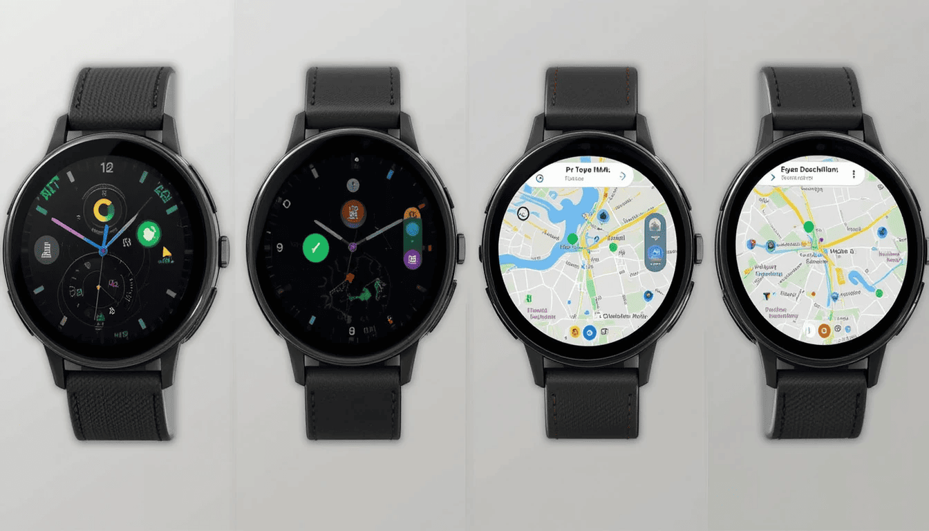
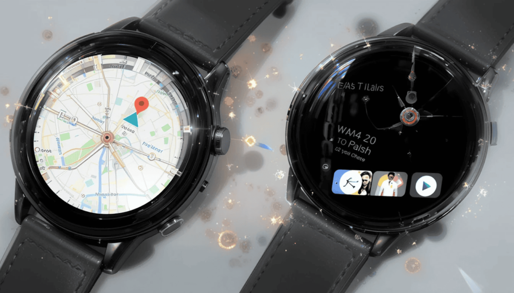
Big Pill for Key Actions: Three side-by-side circles for mic, keyboard, and map are replaced by a two-row design populated with giant pills. The largest pill calls the map layer, followed by a search option (default: voice input).
Shortcuts for Home and Work Destinations: The “Home” and “Work” destination shortcuts are two compact pills. Google doesn’t even show the full address anymore, so as not to take up space and be efficient.
Teal Accent Color: The entire redesign incorporates a teal color accent into the interface. If this will ultimately respect a personal watch face theme is up for consideration.
Why This Redesign Matters for Wear OS
This is the main highlight of the redesign on Wear OS. It integrates Material 3 Expressive into Google Maps for several reasons as follows:
Improved User Experience on Watches: The new design focuses more on glanceability and easy interaction on a smaller circular display. Featuring more spacious icons in the application makes it quicker and easier to find information and begin navigation.
A Common Thread Along the Google Ecosystem: This update aligns Google Maps in Wear OS for Material 3 Expressive. As a result, the consistent message from and across makes the user experience much coherent and intuitive across all the platforms of Google.
Living with the Power of Wear OS 6: This redesign might be on Wear OS 5 for some people. However, it does put one in a perfect position for when Material 3 Expressive comes fully implemented with Wear OS.
Modernizing the Interface of Wear OS: A lot of users say that the previous Wear OS Maps application felt a little outdated. This redesign thus gives it a needed modern aesthetic, making it much more refined and pleasing to use.
Availability and User Feedback
More improvements are being made to Wear OS and its apps by Google. The Material 3 Expressive design language is foundational for creating an emotionally engaging experience for smartwatch users.
The full-fledged rollout of these changes can be expected later in the year. Google gathers feedback for the final version of Wear OS 6.
Conclusion
By bringing a more modern, vibrant, and user-friendly interface to smartwatches, Google is prioritizing both style and functionality.
This update not only enhances the overall usability of Maps on smaller screens but also aligns the experience with the broader Android ecosystem.
As Wear OS 6 approaches, users can expect even more thoughtful UI upgrades. For now, this visual refresh sets a positive tone for the future of Google’s wearable experience.
More Insights: Material 3 Expressive revives the Android experience We enjoy


