


Google is going to launch a New Account Switcher in its Android apps, bringing a fresh approach to managing user profiles. The Google Account Switcher Update replaces the old pop-up card with a full-screen version, offering a more intensive and comprehensive experience for handling multiple accounts efficiently.
The update offers a streamlined, revised appearance over the version it replaces that fits with the overall trend at Google toward harmony of design throughout its platform.
The Account Switcher Evolution
The process of switching was simplified with the help of a small, floating card that opened when you clicked your profile icon. With the New Google Apps UI 2025, Google is redesigning this interaction to provide a more seamless and visually consistent experience across its Android apps.
This floating window has been replaced with a special screen. It appears as a slide-out; instead of the floating window, this full-screen account switcher takes its place. This design philosophy is consistent with Google’s greater Material 3 Expressive push, which focuses on:
Full-Screen Canvas: Displaying the full screen gives extra room to work with and to exchange information and interact. It is because the process of account management does not seem cramped anymore.
Easy to navigate: There is a full-screen interface. It takes them through different accounts without messing around. The user has no distractions from managing their account.
Visual Consistency: The new design is very similar to the account switcher on Google web properties. It adds a sense of cohesion across devices and platforms.
Dynamic Color Integration: The background behind the switcher of various apps consists of a brighter tint of Dynamic Color. It reflects the wallpaper selected by the user, as shown in a more customized manner.
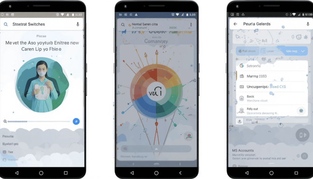
Google’s Apps Embracing Full-Screen Account Switcher
Google will have been in the process of introducing the New Account Switcher to an ever-increasing range of Android apps. Although in many cases, rollout is typically server-side. It can be different based on the user and app version. Below, we list some of the most important Google apps:
1. Gmail: Gmail may be one of the first apps to start displaying such a redesign. Its New Account Switcher now gives a full-screen experience, as it does in the internet version.
2. Google Keep: The note-taking application has also used the new full-screen format to change the accounts.
3. Google Drive: Multi-drive management is easy in this cloud storage/collaboration program through the new account switcher design.
4. Google Docs: The document editing program is based on the same principle as Drive. It relies on having the entire account picker in full screen.
5. Google Slides: The slide app, too, has the familiar universal full-screen account switching.
6. Google Maps: A notable application that already benefits from the redesign because it has the same entrance point as all of the following. It includes “Turn on Incognito mode,” “Your profile,” “Your Timeline,” “Location sharing,” Tireless maps, and “Settings,” etc.
7. Google News: Notifications, activity, and settings are shown in the new full-screen account switcher. They have been added to the news aggregator.
8. Google Tasks: An updated version of the New Account Switcher is also found on the task management app; settings are easily reachable.
9. Google Translate: A New switcher enables users to communicate with multiple accounts in Translate to manage them faster.
10. Google Wallet: The account switcher in the digital wallet application now has Wallet tips, payment settings, ways to pay, and privacy settings.
User experience and projections Future
The New Account Switcher has its disadvantages. It has generated a bit of mixed reception with users having claimed that it is cleaner and more orderly.
In most applications, the fast swiping down on the profile photo continues to let you switch accounts at a high level. You can skip the full-screen view, provided you like that.
The successful use of the New Account Switcher demonstrates that Google is consistently trying to make the overall experience. We will see still more apps being subjected to this redesign.
The Wrap Up
Using the New Account Switcher in Google Apps, it is possible to see that Google has a bigger vision of providing a unified and easy-to-use Android experience.
Google is changing the experience of managing your account by moving the old compact card to a full-screen view. This makes the experience more standardized, immersive, and visually consistent with the mature Material 3 Expressive design language.
Users will have an easier time navigating between apps. Their apps will be more personal, and the design system should feel unified across all of Google.
Also Read: Fullscreen Account Switcher Arrives in Google Apps


