


Google’s file-sharing Android app, Quick Share, gets a significant visual overhaul. The compact bottom-sheet interface has been replaced with the new full-screen redesign that is reaching more users. The new appearance provides a more open and friendly design for sending files among Android devices and even Windows PC.
It was initially introduced in small-scale testing, but currently, it is being rolled out on a large scale, making sharing photos, videos, and documents easier and quicker. Having a simpler interface and enhanced usability, Quick Share is starting to become more of a core aspect of the Android ecosystem. This upgrade means that Google is interested in perfecting its main features in addition to making its cross-platform connectivity a breeze.
Small Popup into Fullscreen Experience
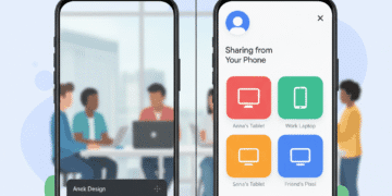
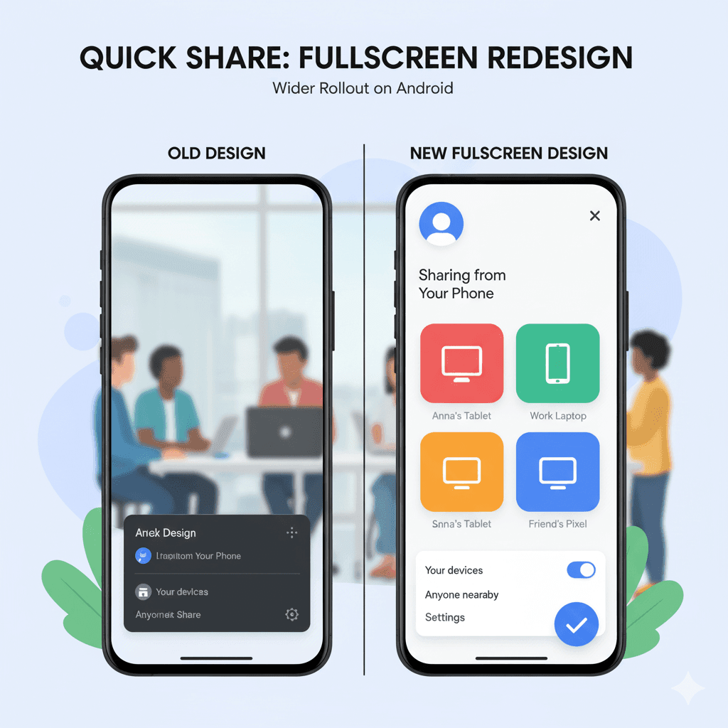
A little pop-up on the bottom of the screen had been used by Quick Share (and it was used by Nearby Share) for years. Although it was efficient in use, the space could be narrow, particularly when numerous other devices were close by or the naming of files was long. The new design modifications that entirely alter that:
Fullscreen Layout: The sharing screen has been completely upsized on the screen, and it allows more space for all the options.
Clear Sender Info: It displays the name and profile picture of the sending device at the top, making it clear where exactly the share originated.
Larger Important Device Icons: The labels and avatars of devices close to each other are bigger, so it is easy to select the appropriate one.
Less Complex Controls: Controls such as settings like Your devices and Anyone nearby are simpler to use and switch.
Increased Visibility and Simplicity of Control
The re-design does not stop at the visual refinement, but it involves creating a better user experience in how they manage the types of shares.
Quick share has also been provided with direct access to important settings with the new full-screen panel, which does not require one to navigate through various menus.
Practical enhancements are also brought by the update, making the daily sharing of files easier. As an illustration, in the case of sharing in Google Photos, the full-screen interface is integrated into the application, and the entire experience becomes a part of a workflow and not an additional step.
Why the Update Now?
The right time is following the rebranding of Nearby Share into Quick Share by Google. The entire screen design appears to target:
Making the Quick Share Brand stronger: A slick and trendy UI creates trust in the primary tool of sharing at Google.
Trying to imitate the Design Style of Google: The full-screen design is designed according to the principles of Material You and Material 3 design, which are based on clarity.
Cross-Platform Consistency: Android-to-PC uses a cleaner design to make the process of sharing information on Windows smoother now.
Hearing Feedback: There might have been too little space on the bottom sheet, and this is taken care of in the update.
Conclusion
Android users have a definite upgrade in the large-scale release of the full-screen Quick Share design. The redesign makes Quick Share a quick, dependable, and easy method of transferring files between Android. Other environments, solidifying Google’s efforts to make its ecosystem more interconnected.
In the future, the full-screen Quick Share interface might lead to further integration with platforms. particularly in the case that Google becomes even more active on Windows and perfects the ecosystem of the Android brand.
In providing a balance between the beauty and usefulness of a product, the new design will transform Quick Share to be not only a background tool but a fundamental part of the Android experience.
o


