


Google is rolling out a major visual overhaul of all its applications. It aims for an expressive and livelier visual language: Google Material 3 expressive redesigns.
M3E builds on Material You and adds bigger containers, rounded pill-shaped buttons, a thicker search bar, and smoother animations. It also utilizes dynamic colors that change according to your wallpaper.
Among Android and Pixel users, it means that several Google apps will have a new, sleek, and modern appearance.
What is the meaning of Material 3 Expressive?
It’s a refinement of Google Material 3’s expressive redesigns. It emphasizes more prominent containers, controls shaped like pills. This is a more substantial search bar at the top of apps, and more lively transitions.
It is also important to mention that even though it still maintains the same personalized dynamic color themes introduced with Material You, with M3E. Google strives to achieve a more visually striking and easier on the eyes interface for its services and products.
According to the most recent news concerning the ambitious design rollout at Google, the following is the list of redesigned apps that have already received the Material 3 Expressive facelift, organized to make them easily referable.
Material 3 Expressive Launched Apps
Features: The bottom bar is now slimmer, and two new tabs have been added – the Hot tab and a New tab – along with a redesigned preview layout.
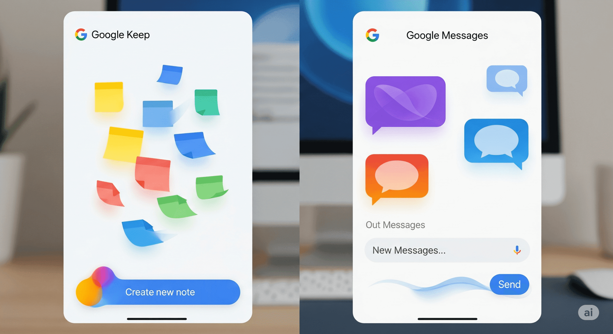
Google Keep: Has a redesigned search app bar that moves controls outside the search field and places them in containers.
The Google Phone: The new design includes three tabs: “Favorites” and “Recents” are merged into a new tab named “Home,” and there is also a new tab named “Keypad”.
The Google Photos: The backup indicator at the top of the app has now been changed to an animated one.
Google Calendar: Time slots are now displayed in rounded, pill-shaped boxes across different views.
Find My Device/Find Hub: The bottom bar is now shorter, and the design uses pill-shaped buttons and larger containers for a cleaner look.
Google Files: The Navigation rail is replaced with a new navigation rail and an animated carousel on the homepage.
Google Contacts: The pill icon-based action buttons appear in a card-style UI.
Editing Google Docs, Sheets, and Slides: Google has introduced some new toolbars and pill-shaped buttons in the editing interface.
Google Meet: Uses giant cards to make calls on the home screen and has a more animated screen prior to the call.
Apps that use Material 3 Exp (Rolling Out)
Pixel Recorder: Interface updated and made easier to use; actions are now in an overflow sheet.
Google Clock: Has a square Floating Action Button (FAB), and alarms that are active have a highlight over the whole background.
Google Drive: Consists of a new search app bar, and the list and grid view options are within a single container.
Gmail: Now includes containerized lists and messages with a pill-shaped animation when performing a swipe action.
Google Messages: Chats are now shown in rounded boxes, and the “plus” menu has a new look with all options in pill-shaped buttons.
What is Actually Changing with M3E?
Although exactly how each app is redesigned is different across apps, some unifying themes can be defined as the Material 3 Expressive redesign:
Alexa Browser Extended
There is a thicker, larger search bar at the top of many of these apps. Elements such as profile images and menu buttons will be out of the search field, and hence the clean look.
List and Card in containers
Lists and individual items within apps are frequently enclosed in large, rounded containers. This assists in visually distinguishing content to make it more orderly and tactile.
Shorter Bottom Bars and Pill Buttons
The buttons are typically taking a rounded and pill-shaped form. In other applications, the bottom navigation bar has been made shorter, thus making the interface process even smoother.
Navigation Rail Split Buttons
Larger screens interfaces also some of the apps are using bottom bar and instead use a navigation rail on a side. The new UI decorations, such as split buttons, are also present on some of the redesigned apps.
How to Update Your Google Apps in
To experience the Material 3 Expressive redesigns, be sure that your Google apps are all set up to the latest versions on the Google Play Store.
Remember that not everything about the redesign will become visible all at once because some of it may be coming in stages through server-side updates, so you may have access to some of the changes prior to others, even with the newest version of the app installed.
Google usually does a staged deployment in order to check stability and receive feedback.
FAQ
Material 3 Expressive: What is it?
A refreshed take on Material Design 3 that leans into bold containers, pill-shaped controls, thicker search bars, and livelier motion, while still using dynamic color.
Why do my screenshots not look the Same as the screenshots I see online?
Rollouts can be phased, and Google can control them using server-side switches. When you are sent the update and how the layout is then presented to you may vary depending on the region you are in and even your exact Google account.
What are some of the hallmark UI changes?
Key visual cues include a more prominent search app bar with controls moved outside the text field, large, rounded containers for lists and cards, buttons shaped like pills, and shorter bottom navigation bars in some apps.


