


YouTube Music is releasing a significant change in its Now Playing screen. It is introducing a new dual-pane interface to both Android and iOS. This redesign not only makes the interface look more modern and clean.
The update also makes it easier to navigate and enjoy music. The design is particularly tablet and larger-phone-friendly. It also supports smaller screens to give a smooth-sailing user experience regardless of the device.
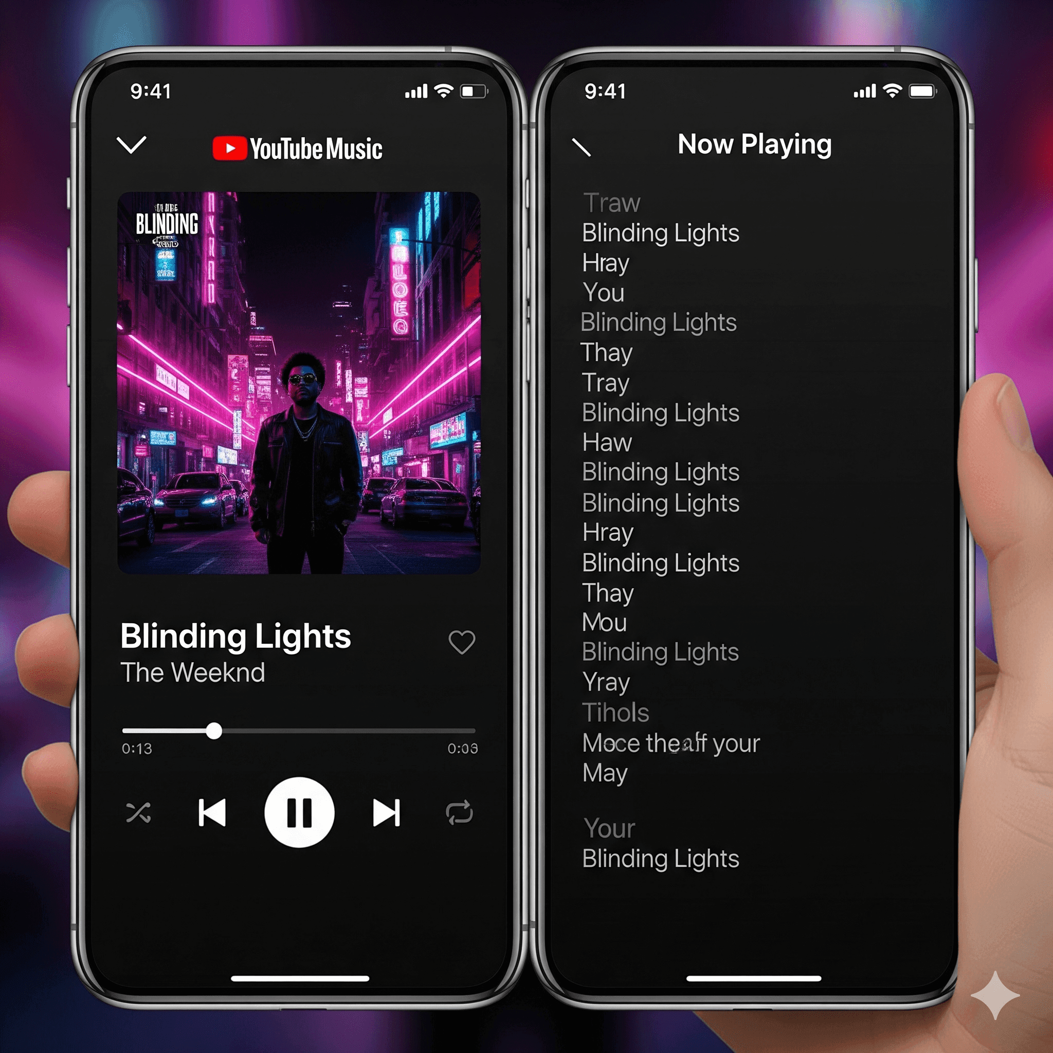
A New Face to Music Playback
The most significant change is the split layout. Rather than the scrolling view that is long, the Now Playing screen is separated into two parts:
Left Pane (Main Control): Displays album art, title of the track, artist information, and the playback core play/pause, skip, and rewind buttons. It also simplifies the Up Next queue and makes it easier to handle.
Right Pane (Extra Features): Gives easy access to either lyrics, related videos, comments, or artist information based on the track.
Increased Accessibility and UX
This is not your typical style update, but one that is designed to be easier to interact with.
Better Queue Management: The “Up Next” queue has become much more visible and allows users to rearrange or add songs without leaving the window.
Quick Lyrics Access: The words of songs are quickly displayed in the second pane, which simplifies sing-alongs or the ability to enjoy music.
Cleaner Controls: The separation of main controls and extras makes the screen look less cluttered.
Modern consistency: The redesign is the same as Material You design on Android and provides a consistent appearance between the two operating systems.
Rollout Details
This upgrading is taking place at the server-side and, as such, will trickle down to Android and iOS users. This step will ensure the YouTube Music app is updated in the Play Store or the App Store, and you will be able to get it as fast as possible.</span>
To maintain the competition with its competitors, Google has been including features and UI changes to YouTube Music. Another step is this redesign, which will be oriented toward an even smarter and richer listening experience.
Conclusion
The redesign of the YouTube Music Now Playing screen is more than just a cosmetic update; it is an upgrade in functionality.
It provides a streamer experience that is cleaner and more efficient by isolating playback controls, as well as other features such as lyrics and the queue, particularly on a larger screen.
With this update, it is possible to see that Google is focusing on making YouTube Music more practical and enjoyable to use, on top of making it more appealing visually.
FAQ
What has changed in the YouTube Music now playing screen?
The most significant modification is the redesign of the duo-pane. One of the panes displays album art and playback controls, and a second p
ane contains additional information, such as lyrics, the “Up Next” queue, or other similar information.
Does it support Android and iOS redesign?
Yes. Both Android and iOS users are getting the dual-pane Now Playing at the same time.
What are the advantages of this dual-pane layout?
It simplifies the process of locating features, it makes the screen look cleaner, it enhances queue management, and it utilizes large displays better.
In the new design, how does the Up Next queue work?
The queue is now visible all the time. You have the option to preview future tracks, rearrange tracks, or add tracks without having to leave the Now Playing screen.
What are the long features that I can get in the second pane?
The second pane may include lyrics, artist information, music videos, or even comments, depending on the song.
Is it something that I must update my app by hand to obtain?
You ought to update your YouTube Music app on the Play Store or App Store.
Will this influence the appearance of YouTube Music on the small phone screens?
Yes. The dual pane can be in the conversion state into tabs or a one-column layout on smaller screens; however, the content separation is still present.
Is it a redesign that is about functionality or design?
Both. It is clean and contemporary, yet more to the point, it makes commands and functions quicker to get and the experience overall more accessible.


