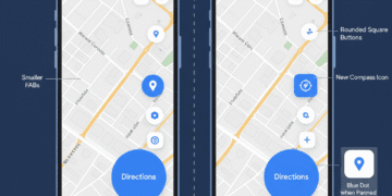


Google Maps on Android is getting a minor but very prominent design update, the FAB new location button. This redesign centers on two important items that the users are engaging with at all times.
The first one is the Floating Action Buttons (FABs). The other one is the Current Location button. These updates make the app more compatible with the modern design language of Google, Material 3 Expressive.
The redesign has focused on simplicity; besides being visually polished, the interface is cleaner and simpler to use. It also indicates the continued work of Google to maintain consistency in its ecosystem of applications to provide even better coherence and ease of use to the user.
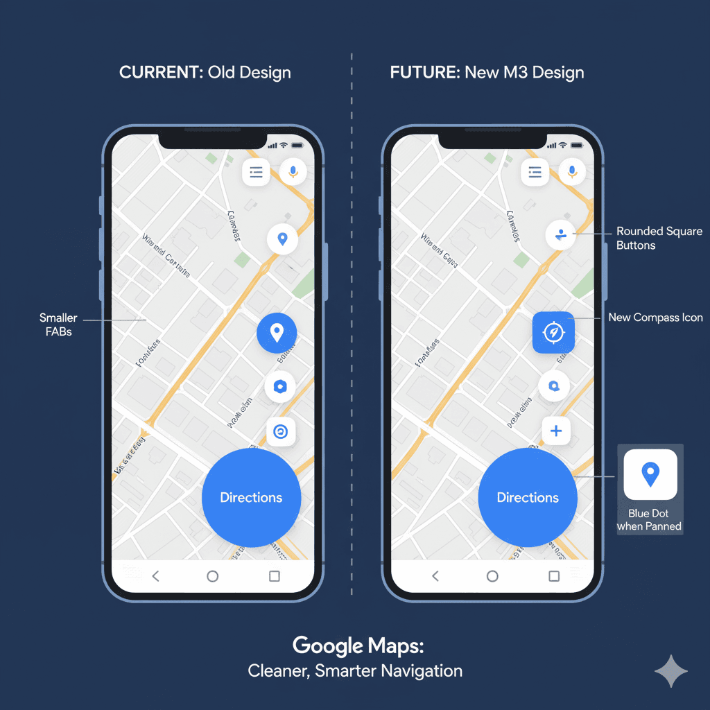
The Floating Action Buttons ( FABs ) Shrink Down
Floating Action Buttons (FABs) are the salient, typically circular, floating buttons that hover over the material and offer the most typical or principal action to that display, such as creating a new email or (with Google Maps) taking directions. The primary “Directions” FAB (which is normally to the right in the lower-right corner) is smaller in the most recent update.
This is due to its adjustment. It is famous for a Mini FAB in Material Design, allowing the map screen to have less visual clutter to allow the user a better view of the content.
The redesign also makes Google Maps more consistent with the design of other recently redesigned Google products, which further reaffirms a more refined and unified user experience.
The Location Button receives a Large Icon Change
The button to center the map to where you are and to orient your vision has also received a new design and improved functionality.
New Design: The button has ceased to be a plain circle. It has been placed in a rounded square container, and this is similar to other interface elements of the new design.
Intelligent Iconography: The icon itself has been modified to be more understandable:
Compass Icon: When the focus is on your present location, the full-filled arrow of blue color is changed to a compass icon. This new icon is easier to use in displaying directions.
Blue Dot Icon: When you pan the map off of your current live position, the icon transforms to an empty arrow that turns into the blue dot that Google already uses to show your current position on the map layer. This gives it a visual language that is consistent.
More Intuitive Action: This icon change helps you better see when the map is tracking you and not when you have manually moved it out of frame. By pressing the button, you pop back to where you are.
Other Subtle Design Tweaks
Other minor adjustments to the Material 3 Expressive appearance are in this update:
Layers Button: The button to choose various map layers (such as Satellite, Transit, or Traffic) has been slightly revamped. It is still a circle, with a little addition of a plus sign to the current design.
Listing Buttons: Primary actions, such as Call or Save, vary in a place listing that you are viewing. Their containers are also changing from the old round design to the new rounded squares.
Conclusion
Google is making the interaction process a little bit smoother by minimizing visual clutter on the screen and simplifying the core navigation controls, which is beneficial to users who use the application daily.
Not only does this make them more usable, but it also shows a larger effort of the company to be consistent in the rest of the design ecosystem. Google Maps is constantly getting smarter and more useful as an up-to-date and effective companion in our daily travel.
FAQs
What is a FAB in Google Maps?
FAB is an abbreviation that means Floating Action Button. It is the large circle button, usually of Directions, at the bottom right.
What changed in the new update of the FABs?
They are made smaller, hence minimizing visual clutter on the map.
Is the Location button any different in shape?
Yes, it is no longer a circle, but a rounded square.
What new icon is the Location button when I am at the center position in my location?
It has become a compass symbol, instead of the former blue, filled-in arrow.
Do you have this update on iOS (iPhone)?
The set of button changes in question is only being implemented for Android users at this point.
Does that update alter the button of Layers?
Yes, there is a slight update on the layers button. It is retaining its circular shape of circle with a slight addition of a plus sign.


